This article will guide you through what configuration capabilities are available for Oden Now Factory monitoring and how to utilize them to customize the view your teams should use.
Topics
Interacting with the Edit Panel
Showing Configured View
During initial release, the configured view can be found in the drop down at the right end of the blue bar by selecting List (beta). Once you select to view this version, it will be remembered next time you open the page so you won't need to continuously select it. The standard List view will continue being available for the first month after the configured view is released, after which we expect to consolidate the two.
Interacting with the Edit Panel
In order to perform any configuration you will first need to enter edit mode by clicking the pencil icon near the top right corner of the screen. After clicking this icon, you will see a series of buttons in the white space just below, as well as a series of menu buttons at the top of each column. At this time, all editing is done through these buttons, there is no drag and drop or direct text editing supported.
Once completing a configuration, make sure to click the green Done button to save the view. Saving will only save to your browser and will not be available to other users or computers. See the Sharing Oden Now Configurations article for more info on that capability.
Lastly, make sure you can hit Cancel at any point to close the edit menu without saving updates. This will maintain the last configuration you saved, or the default configuration if none.


Types of Configuration
Highlighting Data Against Thresholds
How to Configure
Adding and Removing Data
To remove any of the standard or self-configured columns, just click the ... menu button directly above the relevant column and select Remove column.

To add columns, start by clicking the Add Column drop down, which will present two or more options to select from. The Metric Summary and Live Metric options will always be available. You will also see any of the standard columns which have been removed from the page, such as Current Production as shown in the screenshot below.
Selecting standard columns will return them to the page as defined by default. The other two columns allow custom selections from your organizations data.
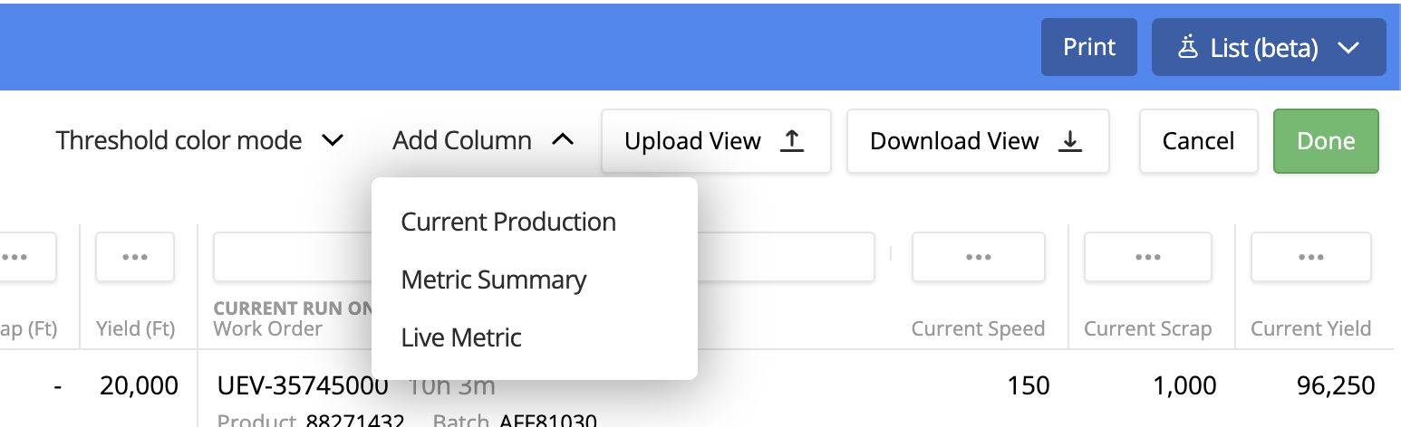
First, the Live Metric column allows you to add any data point and will show the current value of that data for each line. From the drop down, select that option and you will be presented with a pop over menu. Select the desired metric from the list and click Done to add a metric to the view.
Note: Only metrics which have been configured in your organizations metric taxonomy will be available in this list. If you add a metric and see the triangle warning as shown below, it likely means the relevant metric has not been configured on that specific line. Talk to your org admin or Oden CSM for more info on this topic.


The last type of column that can be added is a Metric Summary. This similarly allows you to add any metric in your organization to the view, but instead of showing the most recent value, it will show a specified aggregate over the current time frame selected for the window. After selecting to add this column type you will see a pop-over menu. You can still select any metric configured in taxonomy, but also must specify an aggregation type.
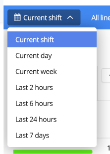
This column will now show the value for the selected metric, using the chosen aggregation type, over the timeframe selected in the top left corner of the page, such as current shift as shown in the below screenshots.


Highlighting Data Against Thresholds
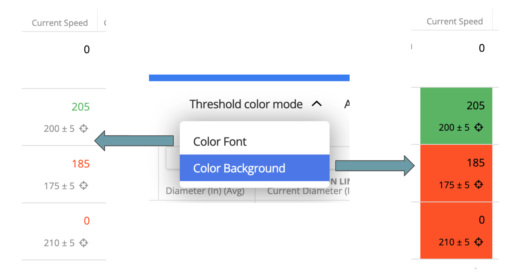
In the default Oden Now view, the Current Speed column has its font colored red or green if you have product targets set for those speed values. (Please reach out to your org admin or CSM if these are not configured and you think they should be!) You can further configure to toggle between highlighting font color vs. background cell color, specify or change the color formatting relative to thresholds, and add manual thresholds where product targets don't apply or aren't available.
First, to change between font highlighting and cell background highlighting, simply click the Threshold color mode drop down a select the desired option.
Next, you can update what thresholds are used and set the relevant color rules for any other value columns. To do so, click the ... menu button above the desired column and select Edit column thresholds.

This will bring up one of the 2 similar pop-up menus show below. The first menu will be shown for KPI's and summary metrics, where thresholds based on product targets are not available. The second is for live metric columns, where thresholds will be relative to the current product if there are targets set for this metric. In this case you still have the option to specify secondary thresholds to be used when product targets are not available.


To set manual thresholds, click the drop down box where None is shown then select Manual Entry.

You can now enter fixed threshold levels for a Lower bound, Target, and Upper bound.
(Note: These thresholds only effect color coding on this page at this time, they have no impact on targets or kpi's elsewhere in the platform)

Finally, you can set behavior for color coding these cells relative to those thresholds. Remember that thresholds will be based on product targets when available, and the manually set thresholds otherwise.
For each range, click the box and select the relevant color desired. Default will maintain the standard white background and black text.
When choosing these ranges, the first box applies to values below the lower bound, the second is between the lower bound and target value, the third is between the target and upper bound, and the fourth is any value greater than the upper bound.

Formatting Page and Columns
Formatting the page and column currently includes rearranging column orders, resizing columns, and editing the column name and decimal precision of data. All of these actions can be found in the ... menu above each column.
To rearrange the order of columns, select the menu then click Move Left or Move Right. You can continue selecting a column and moving further in either direction, with the exception of the center line. Columns to the left of this line are associated with the view time range selection. The columns to the right of this line are either live metrics or associated with the current production run. Columns cannot be moved between these halves at this time.

If you would like to resize columns, just hover over the light gray line between any of the menu buttons, click, and drag.

The final 2 column configuration options can both be found by selecting Edit column display. This will bring up the pop-up menu shown below. With the option to rename the displayed column title, or adjust the number of decimals displayed.


